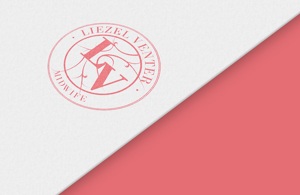
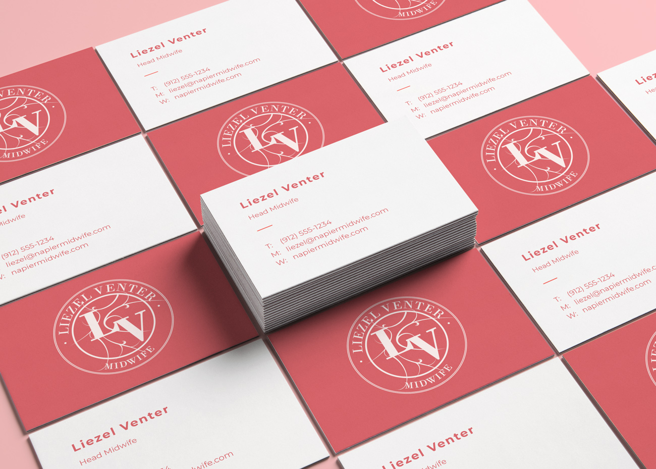
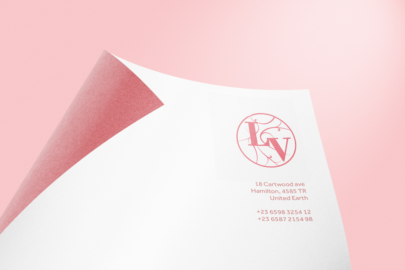
Liezel Midwifery
Logo | Business Cards | LetterheadAs you can tell from the last name, this was a project for my mum who is a midwife. She wanted a logo represented her as classically ladylike. We avoided the cliches of typical Midwifery logos of a mum holding a tummy. We decided on a stamp design, something you imagine in a old hotel. The added vines around her initials were added to give some visual interest, while the weight of the initials keep these from being distracting.
Next Project ›› Back to All Projects ››